Colour Psychology in Exhibition Stands
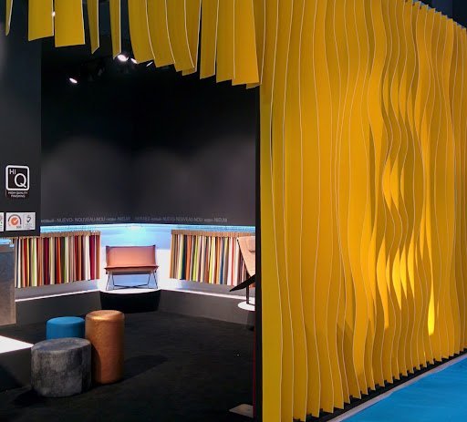
Colour is the first message perceived on a fair floor before any text is read. Used well it makes the brand memorable; used badly it loses it in the crowd.
Brand colour leads, support colours assist
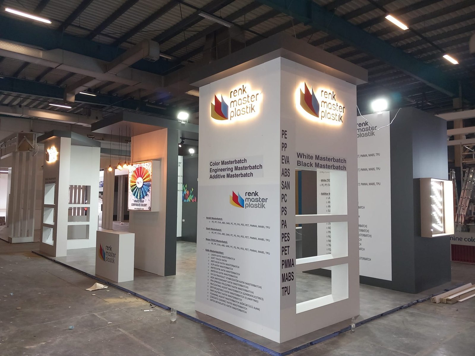
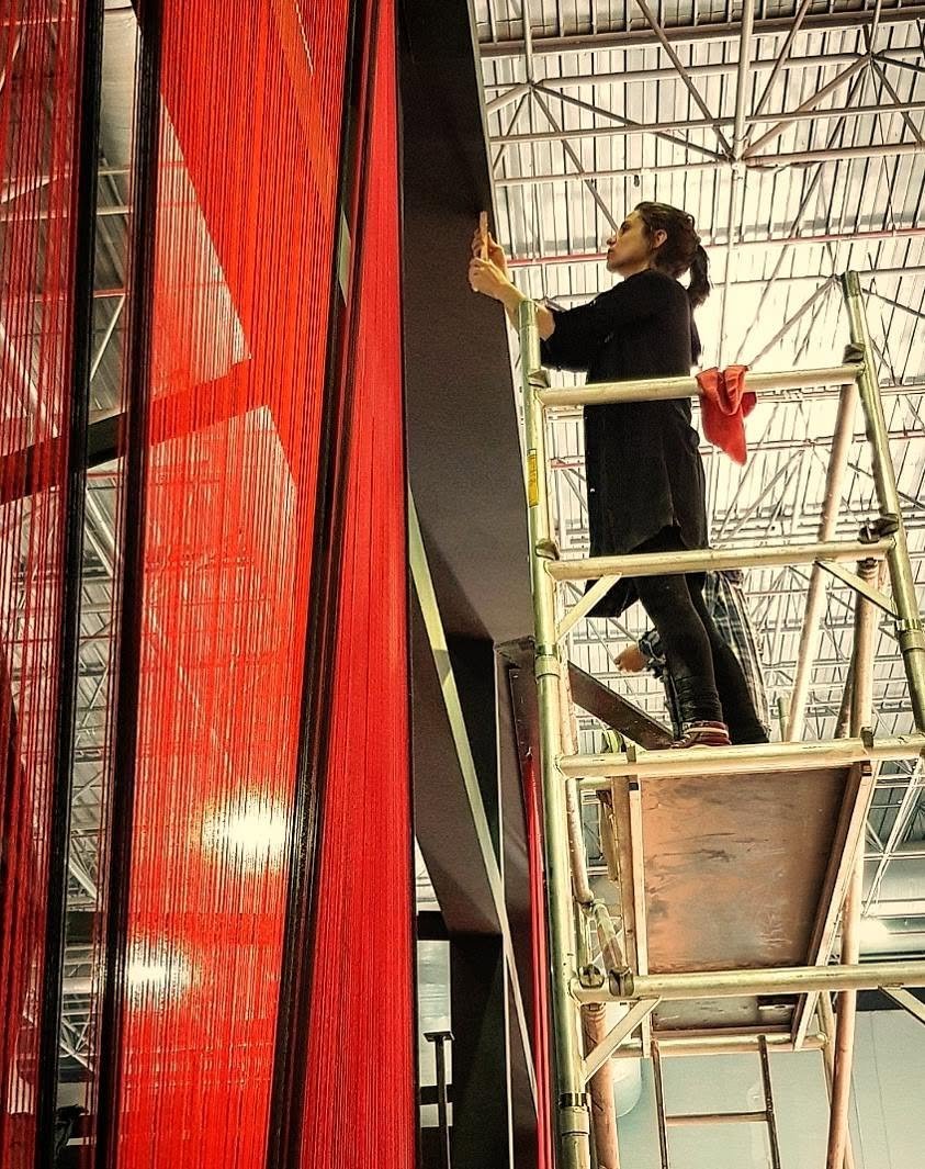
A dominant brand colour on the large surfaces of the stand increases recognition. Supporting colours should be used for accent and balance; too many colours scatter the message.
The effect of warm and cool colours
Red, orange and yellow suggest energy and attention; blue and green give trust and calm. These effects can vary by culture and sector, so the target market should also be considered.
Think together with light
Colour looks different under light. Warm light tones soften paints; cool light brings out metallic and blue surfaces. Testing on a sample reduces surprises.
Quick checklist
- One dominant brand colour
- Limited supporting colours
- Cultural meaning in the target market
- Colour test under light
Would you like ideas for your exhibition stand or space project? Get in touch with us; we will suggest a solution that fits your area and schedule.
Let's design your next stand together.
Tell us about your project and we will get back to you with the best-fitting solution.