Applying Logo and Brand Identity on an Exhibition Stand
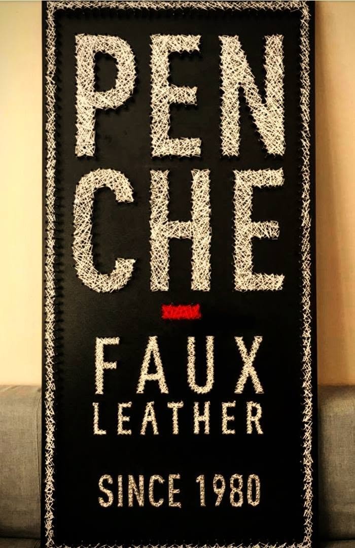
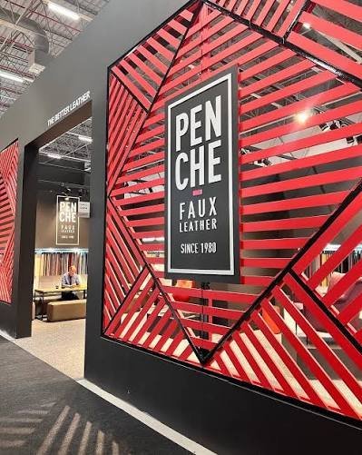
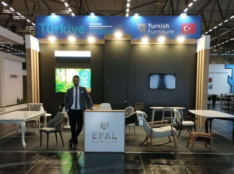
The logo is the smallest but most important part of the stand. Used in the right place, at the right size and with the right light, it makes the brand readable from the other end of the hall.
Size and height
The logo should sit above eye level and be large enough to be read from several metres away while visitors walk the aisle. Small, low-contrast logos get lost in a crowd.
Illuminated applications
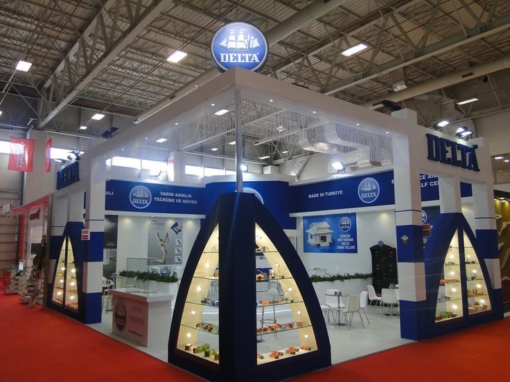
Box letters, illuminated panels or backlit surfaces separate the logo from the general lighting of the fair hall. The colour temperature of the light should be chosen to match the brand colours.
Spreading identity into architecture
Brand colours, forms and typography should be repeated consistently not only in the logo but in walls, floor, furniture and graphics. That way the stand is remembered as an experience, not a logo.
Quick checklist
- Size readable from afar
- High contrast
- Illuminated or high position
- Consistency of colour and form
Would you like ideas for your exhibition stand or space project? Get in touch with us; we will suggest a solution that fits your area and schedule.

Let's design your next stand together.
Tell us about your project and we will get back to you with the best-fitting solution.